The following bar graph shows the percentage breakup of a person's salary from the year 2001 to 2005 in terms of Transport Expenses, EMI Expenses,...
Question
The following bar graph shows the percentage breakup of a person's salary from the year 2001 to 2005 in terms of Transport Expenses, EMI Expenses, and Savings.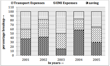
In which year is the ratio of EMI expenses to Savings the third highest?