The pie charts show the distribution of science and commerce students over five years from 2012 to 2016. The total number of students each year and th...
Question
The pie charts show the distribution of science and commerce students over five years from 2012 to 2016. The total number of students each year and the percentage of commerce students are given. It is also known that the number of commerce students in 2013 is 8 less than that in 2015.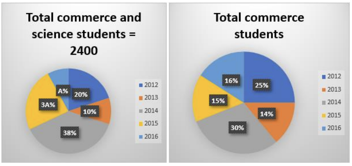
Using this data, find the ratio of commerce students in 2016 and 2015 to the total students in 2015.