The pie chart shows the total number of students (Science + Commerce) in five different years from 2012 to 2016, with a total of 2400 students. Anothe...
Question
The pie chart shows the total number of students (Science + Commerce) in five different years from 2012 to 2016, with a total of 2400 students. Another pie chart shows the percentage distribution of commerce students for these years.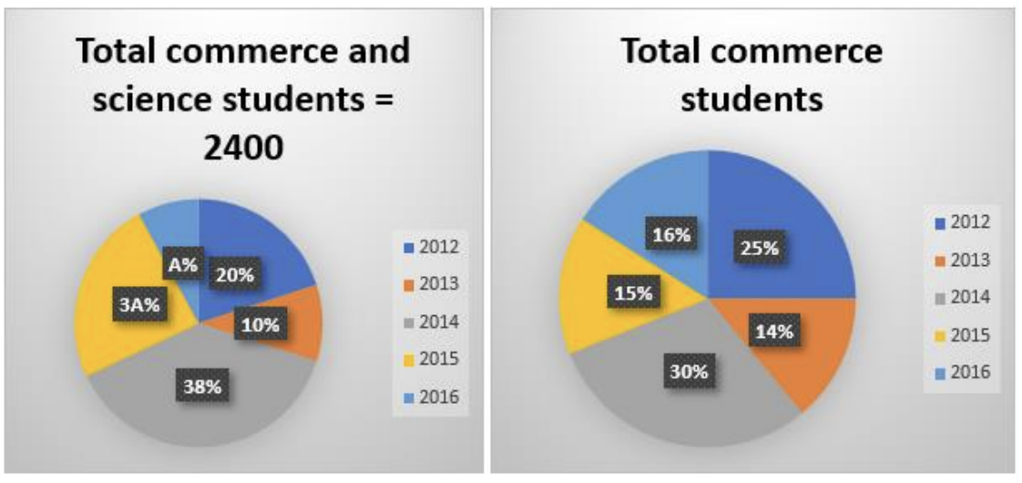
Given that commerce students in 2013 are 8 less than those in 2015, find the difference between the average number of students in 2012 and 2016 and the total number of science students in 2015.